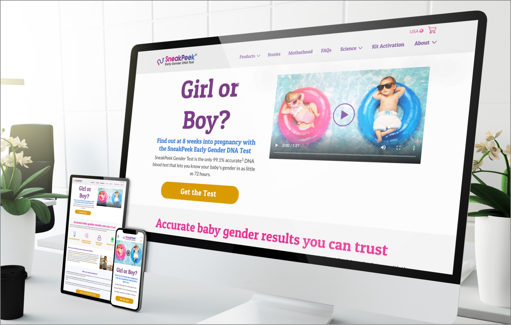
SneakPeek Test
Case Study
Sneak Peek provides early gender DNA tests to action-oriented planners in a collaborative, fun and legitimate environment with an honest and friendly voice while helping soon-to-be-parents feel educated, excited, and reassured of the gender of their baby.
We approached DOiNG GOOD because we really liked their design style. And they didn’t disappoint. While Adrian is the main designer both he and Dawud did a fabulous job interpreting the design ideas I had in my head. Loved working with DOiNG GOOD. And our conversion rate on our tests is up 126% since we launched our new website.
Angela Shue, Marketing Director
Challenge
SneakPeek’s previous website design was tired and outdated and their conversion rate was slowing down. They also couldn’t make changes to their homepage like they wanted.
Outcome
We reduced a lot of the overwhelming color on the site and gave them a fresh, modern look. And we designed in areas to the homepage where they could easily make changes to do more robust conversion testing.
Scope of Work
-
Discovery -
Moodboard Design -
Visual Website Design
The Bottom Line
As a hip, innovative, and forward-thinking SneakPeek stands out as the leader in early gender testing. Their brand is well-established but was in need of a refresh. We improved the layout, design, functionality, and organization of their website.
Branding
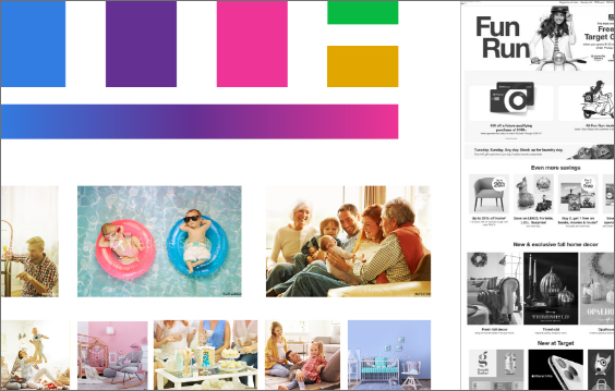
Normally we’re deeply involved with refreshing and optimizing the visual branding. In this case SneakPeek has a well-established brand and felt their logo and color scheme was optimized to their audience already. Our main goal was to create a moodboard, styleguide and overall design that would use their color scheme in a more subtle manner. (*note, we did not design their logo)
Web Design
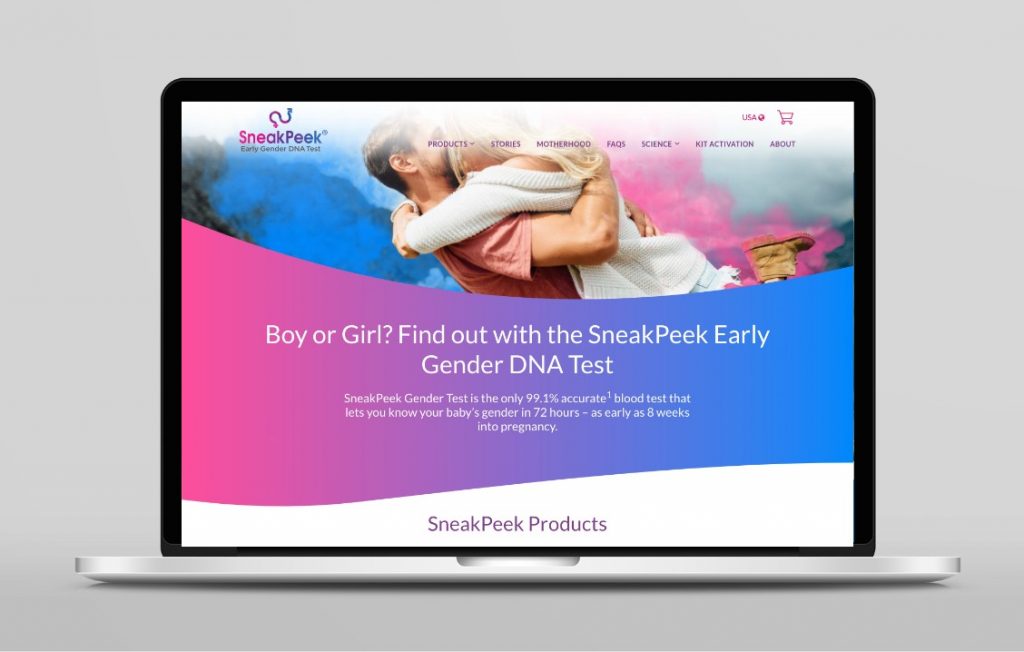
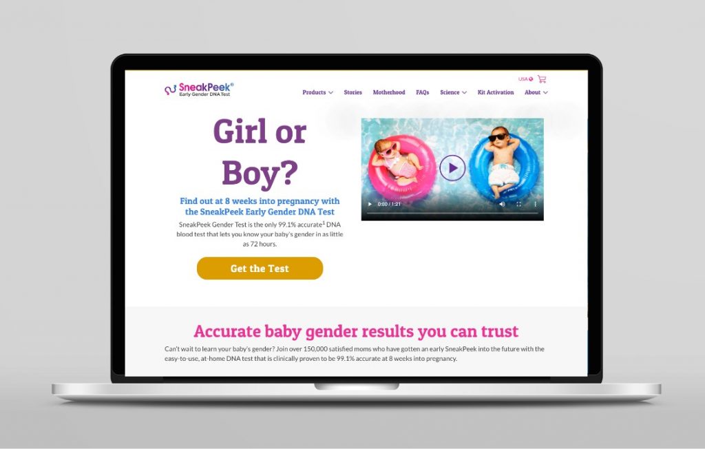
SneakPeek wanted to simplify their design while making it feel young and hip to connect better with their target audience of young families having children. We put an emphasis on white space and used more subtle colors to have different elements stand out. Also important to them was having the flexibility in each homepage section to change and move things around – without needing to use code- in order to run ongoing tests for optimizing their content for the highest conversion rates.
Mobile Design
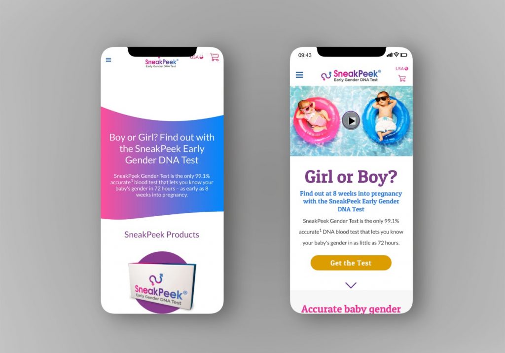
SneakPeeks targeted clients are younger couples just starting a family so the mobile experience was crucial in this project. Our focus to incorporate the video they already had along with having the call-to-action above the scroll on most mobile phone sizes. Again, here we took advantage of a mobile-responsive design where the desktop and mobile is one website that adjusts its layout based on the screen size.
Thank you. We look forward to chatting with you about your needs.