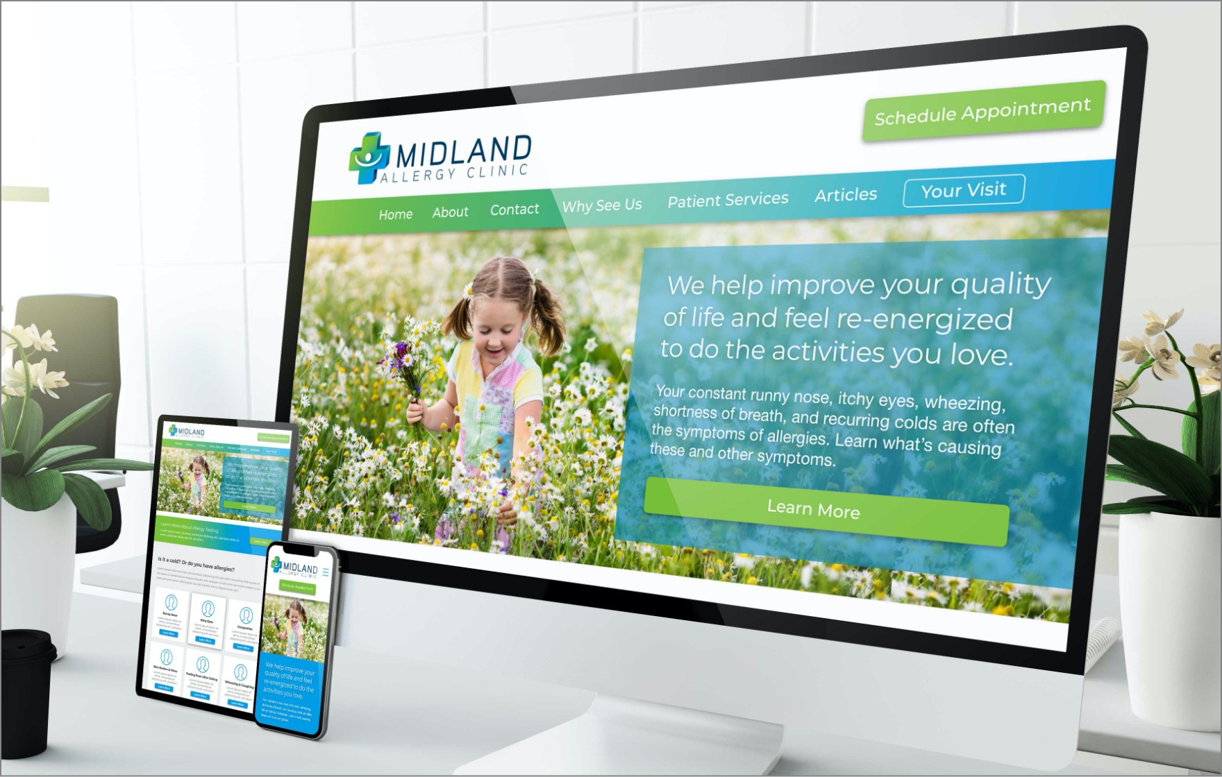
Midland Allergy Clinic
Case Study
Midland Allergy Clinic is the ‘go to’ allergy and immunology clinic that provides superior allergy relief to smart and engaged patients in a caring, guided, and family-friendly environment, helping them improve their quality of life and feel re-energized to do the activities they love!
“We worked very closely with DOiNG GOOD. They were a pleasure to work with and gave us great ideas on how to improve our branding and help educate our patients through the site.” Dr. Jonathan Horbal, Midland Allergy Clinic
Challenge
Refresh and modernize how the community views the clinic. Reposition the clinic in a new manner that welcomes families. Create a site that educates the patient on allergies while communicating how treatment can improve the quality of patient’s lives.
Outcome
Through Discovery we created a Brand DNA to guide their messaging – visual and content. We Modernized their logo and brand assets and built a modern, fresh website with great functionality and educational elements. Finally we improved their image with a vibrant, welcoming and modern design aesthetic.
Scope of Work
-
Discovery -
Brand Strategy -
Messaging + Content -
Brand + Identity Design -
Visual Website Design -
Website Development -
Digital Marketing
The Bottom Line
Through a few unchecked social media complaints Midland Allergy Clinic had developed a poor local reputation which did not reflect the quality of their work. These caring Doctors, along with their staff, worked to improve their office relations while DOiNG GOOD created a new vibrant brand that reflected their new positioning. We focused on great user experience, client education and a family-first approach to health care.
Branding
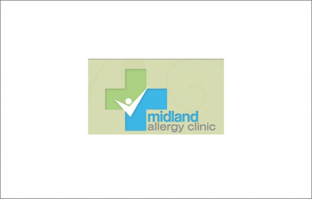
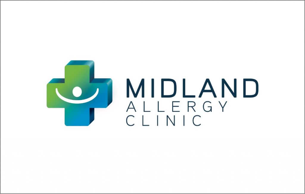
Based on the Brand DNA we created a modernized logo, assets and style guide. The style has elements of warm and welcoming shapes, brighter color palette, contemporary fonts and more depth suggesting Midland Allergy has changed, grown and now offers its ideal patients even more value.
Web Design
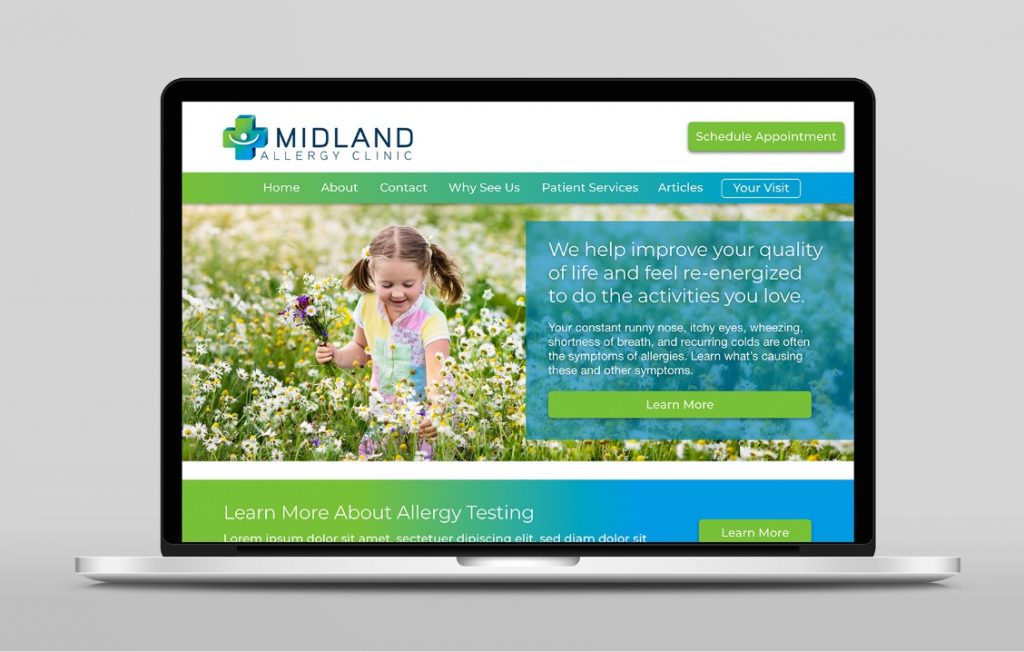
Staying true to the new brand identity Midland Allergy’s website is now modern and fresh while being much easier to use. Even though we tripled the number of pages on the site the content is easy to find. In the final design we went well beyond just look and feel to make sure the site educated potential patients; making it easy for them to find what they were looking for. Our primary goal of a website that would educate new and returning patients was certainly achieved.

Mobile Design
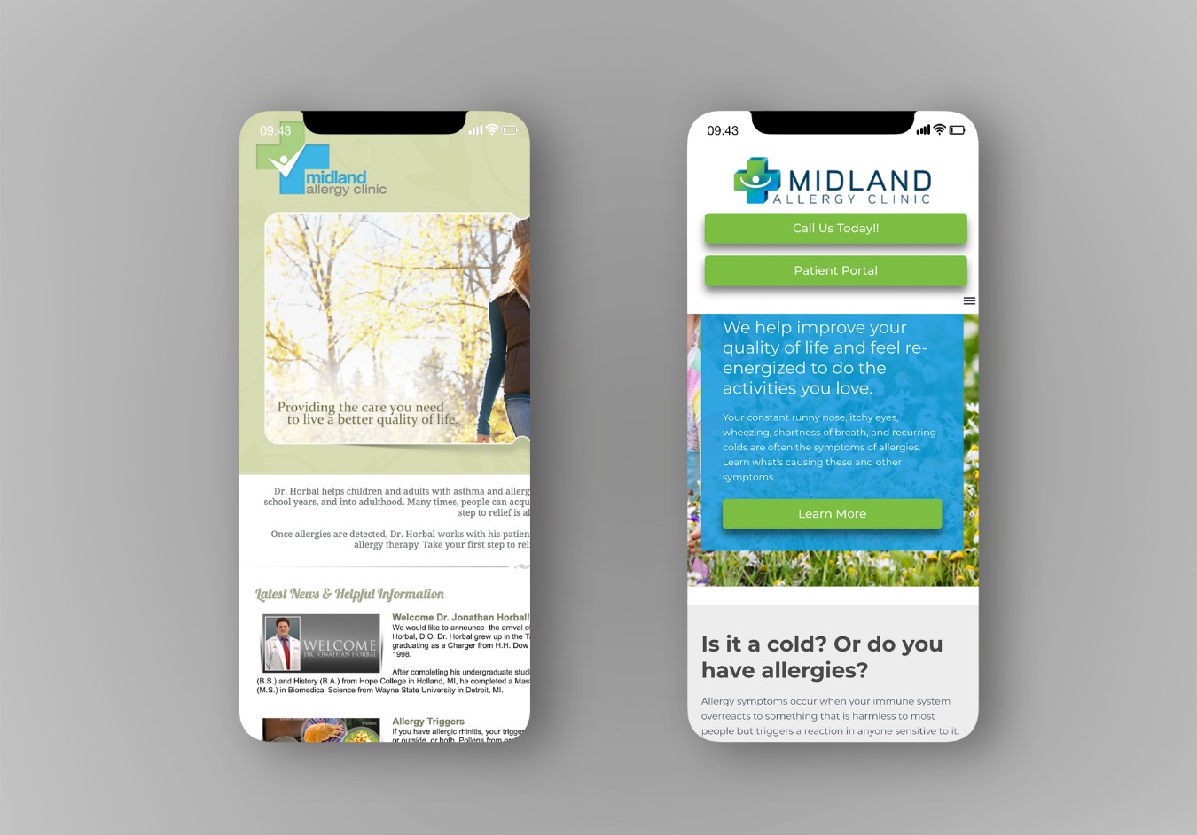
All websites today must be mobile friendly. The Midland Allergy site achieved this by organizing the design, layout, structure and content using modern mobile-responsive design. Mobile-responsive design allows their website to adjust it’s layout based on the device it’s being viewed on. In the screenshots below you can see the difference between a website that’s not mobile responsive (on the left) and one that is (on the right).
Thank you. We look forward to chatting with you about your needs.